Echoes of Riot is a rebellious, analog-inspired brand concept created for a fictional indie rock band with roots in raw emotion, vintage grit, and poetic chaos. The visual identity blends lo-fi texture with bold typographic energy—perfect for a band that sounds like broken hearts on cassette tapes and open chords in smoky bars.
Logo Concept Breakdown:
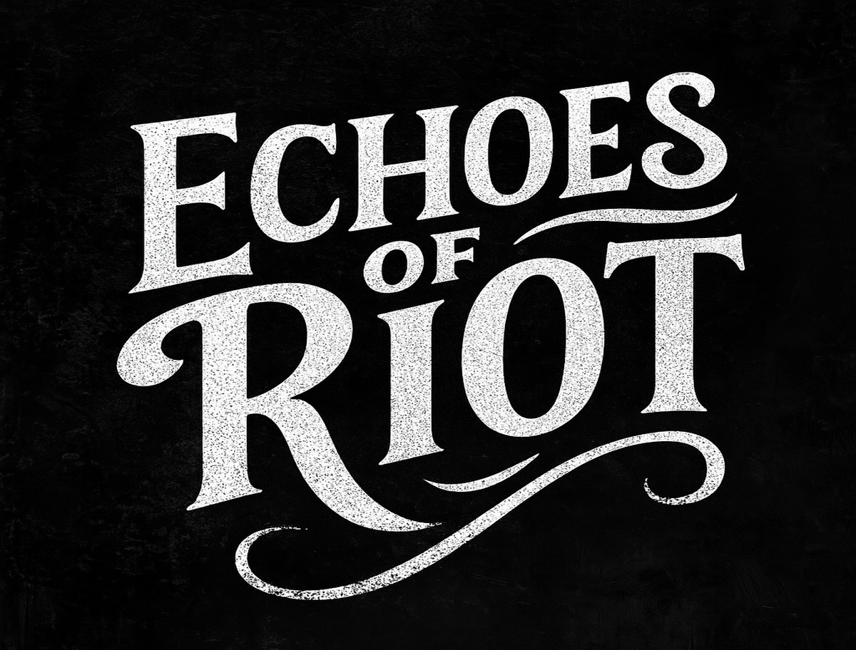
Variation 1: Distressed Serif Wordmark
A tall, weathered serif typeface with sweeping curves and rough textures. The stark black-and-white design evokes classic rock posters and gritty underground zines.
Best for album covers, black band tees, posters, and sticker bombs.
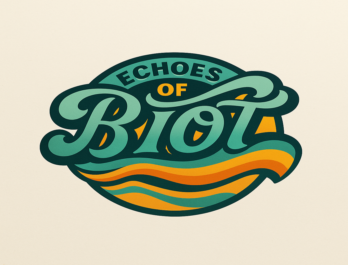
Variation 2: Retro Wave Emblem
A round, badge-style layout with psychedelic waves and warm 70s hues—sunset golds, teal greens, and burnt oranges. Stylized script gives it a nostalgic vibe with modern polish.
Best for tour merch, vinyl jackets, enamel pins, and festival banners.
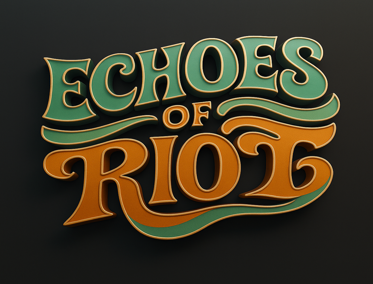
Variation 3: Dimensional Tilted Letterform
A stacked, high-impact layout with bold shadows, angled strokes, and layered depth. Clean lines meet vintage curves for a modern-retro crossover with punch.
Best for stage visuals, music videos, social media headers, and web branding.
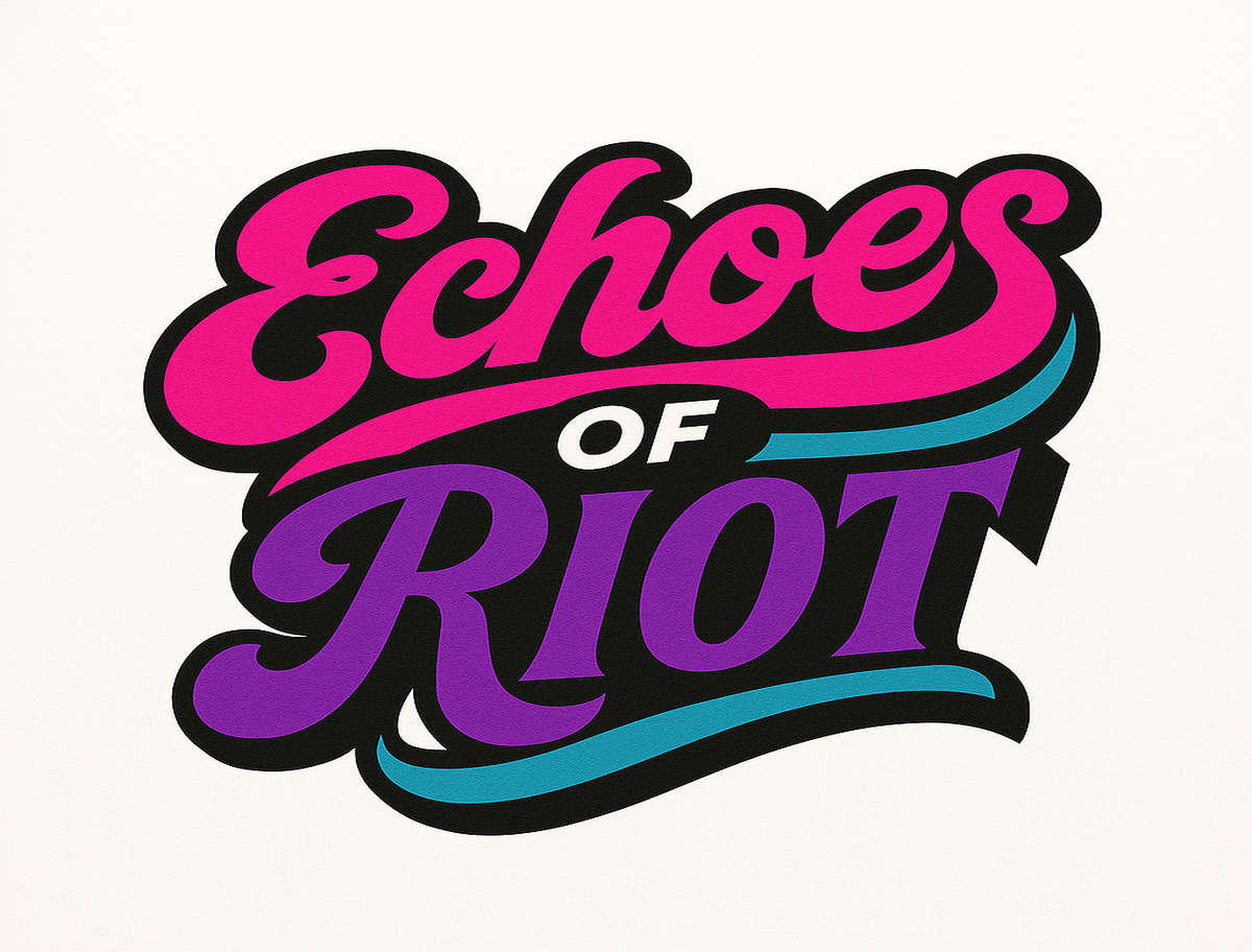
Variation 4: Riot Pop Glitch Mark
An electric neon style in pinks, blues, and purples. Sharp contrasts and glitch-like curves bring out a chaotic, youthful spirit.
Best for digital-first promos, special edition drops, and animated loops.
Brand Mood:
Analog, rebellious, poetic, and loud. Echoes of Riot captures the soul of a garage-born rock band-messy, beautiful, and unforgettable. The visual tone is vintage-inspired but unafraid to evolve, built for bands that wear heartbreak and distortion like a badge of honor.


