Echoes of Riot
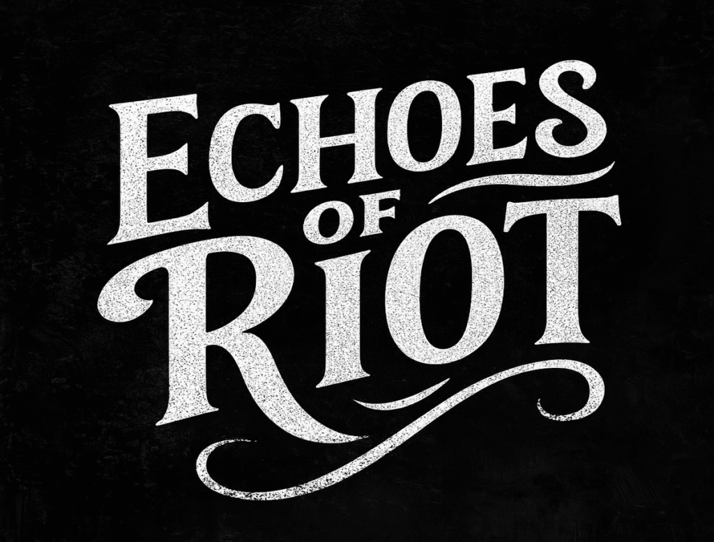
Echoes of Riot is a rebellious, analog-inspired brand concept created for a fictional indie rock band with roots in raw emotion, vintage grit, and poetic chaos. The visual identity blends lo-fi texture with bold typographic energy—perfect for a band that sounds like broken hearts on cassette tapes and open chords in smoky bars.
Logo Concept Breakdown:
Variation 1: Distressed Serif Wordmark
A tall, weathered serif typeface with sweeping curves and rough textures. The stark black-and-white design evokes classic rock posters and gritty underground zines.
Best for album covers, black band tees, posters, and sticker bombs.
Variation 2: Retro Wave Emblem
A round, badge-style layout with psychedelic waves and warm 70s hues—sunset golds, teal greens, and burnt oranges. Stylized script gives it a nostalgic vibe with modern polish.
Best for tour merch, vinyl jackets, enamel pins, and festival banners.
Variation 3: Dimensional Tilted Letterform
A stacked, high-impact layout with bold shadows, angled strokes, and layered depth. Clean lines meet vintage curves for a modern-retro crossover with punch.
Best for stage visuals, music videos, social media headers, and web branding.
Variation 4: Riot Pop Glitch Mark
An electric neon style in pinks, blues, and purples. Sharp contrasts and glitch-like curves bring out a chaotic, youthful spirit.
Best for digital-first promos, special edition drops, and animated loops.
Brand Mood:
Analog, rebellious, poetic, and loud. Echoes of Riot captures the soul of a garage-born rock band-messy, beautiful, and unforgettable. The visual tone is vintage-inspired but unafraid to evolve, built for bands that wear heartbreak and distortion like a badge of honor.
Craft & Grind Co.
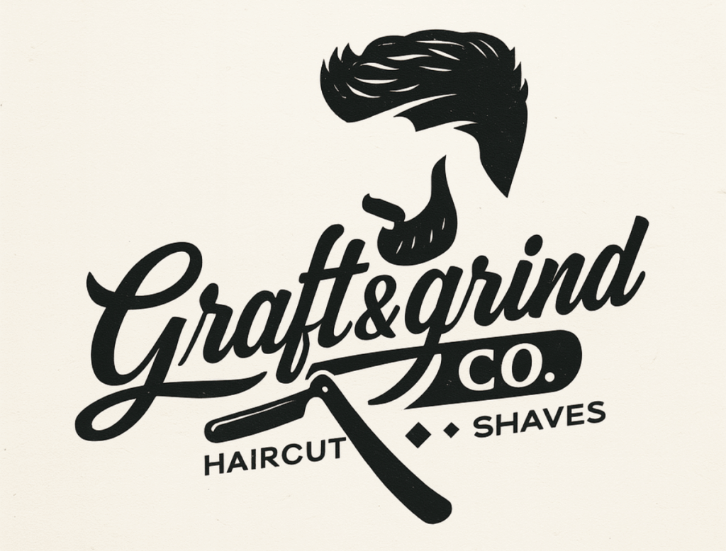
Craft & Grind Co. is a bold, masculine brand concept crafted for a fictional barbershop rooted in vintage grit and modern craftsmanship. The visual identity captures the rugged tradition of grooming with a confident, contemporary edge.
Logo Concept Breakdown:
Variation 1: Dimensional Woodcut Wordmark
A bold sculptural typeface rendered in mahogany wood texture. Strong curves and rich depth evoke heritage craftsmanship with modern precision.
Best for signage, plaques, and premium branding.
Variation 2: Ornate Vintage Crest
Inspired by classic trade signs, this crest features scrollwork and grooming tools for a timeless, masculine feel.
Best for shave kits, packaging, and membership cards.
Variation 3: Modern Icon Script
An energetic script paired with a bearded figure and razor icon. Balances vintage cues with urban swagger.
Best for apparel, stickers, and digital media.
Brand Mood:
Masculine, gritty, crafted, and confident. This identity fuses old-school barber tradition with bold, modern storytelling.
Burn Theory Vape
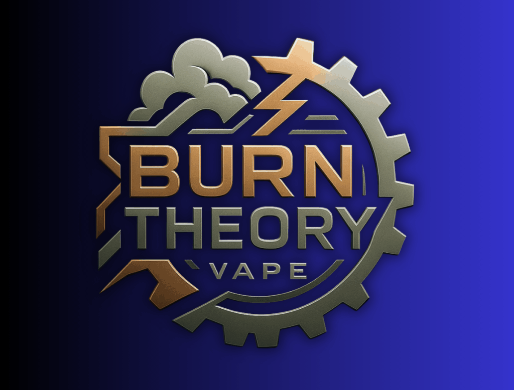
Burn Theory Vape is a gritty and modern logo exploration designed for a fictional vapor product company with an aggressive edge and a strong visual identity. This concept series explores brand versatility through multiple design directions that each communicate power, combustion, and controlled chaos.
Logo Concept Breakdown:
Visual Motifs:
Fire, smoke, lightning, and gear-inspired elements were incorporated to reflect both the raw energy of the product and the controlled engineering behind it. Each variation speaks to a different target market within the vape industry – from premium to street-level, and from tech-forward to bold and rebellious.
Logo Variants:
Smoky Flame Badge: Rugged and stylized with layered smoke effects and a centered flame.
Letterform ‘B’ Flame Monogram: Modern and sleek with a custom “B” wrapping around a stylized burn icon.
Gradient Cloud Impact Mark: Neon-style visual with a vapor trail look for streetwear or digital branding.
Metallic Gear Emblem: Industrial and precise, reflecting a more mechanical vibe suited for hardware or tech-influenced packaging.
Color & Tone:
High-contrast palettes using ember reds, glowing oranges, and metallic accents convey heat and intensity – perfectly matched with moody, dark backgrounds.
Typography:
All-caps, sans-serif wordmarks with a strong horizontal presence were chosen for brand readability and impact.
SoulShine Photography
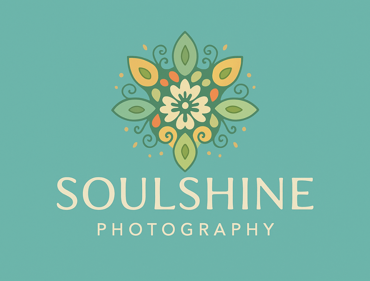
SoulShine Photography is a warm and expressive brand concept designed for a boutique photographer who celebrates light, life, and human connection. Rooted in organic shapes and vibrant tones, the logo captures the balance between artistry and authenticity.
Logo Concept Breakdown:
Symbol Design:
The centerpiece of the brand is a blooming, mandala-inspired floral emblem – a metaphor for growth, soul expression, and natural beauty. The symmetry reflects focus and intention, while the hand-drawn edges soften the structure for an approachable, artisanal tone.
Color Palette:
Earthy greens, sun-washed golds, and playful coral accents bring warmth and life to the identity. Background color variations (light, dark, terracotta, aqua) show the logo’s adaptability across brand materials.
Typography:
A modern serif logotype balances strength and softness. The clean sans-serif secondary text (“Photography”) supports legibility and structure, making it easy to use on packaging, business cards, or social platforms.
Brand Mood:
Soulful, natural, radiant, and human. This brand feels like it belongs to someone who captures light not just through a lens — but through presence and connection.
Black Clover Creative
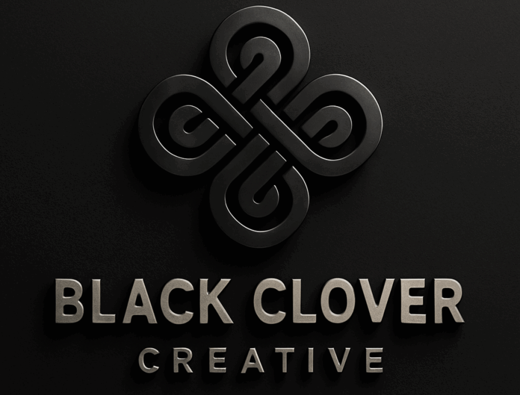
Black Clover Creative is a bold and modern logo concept designed for a fictional creative agency rooted in symbolism, minimalism, and visual strength. This identity explores four distinct variations of the clover motif — blending elegance, symmetry, and brand adaptability across different use cases.
Logo Concept Breakdown:
Core Symbolism:
The clover, often associated with luck and growth, is reimagined as a sleek geometric emblem that symbolizes creativity unfolding from a central, balanced core — representing strategy, design, marketing, and development working in harmony.
Design Variations:
1. 3D Monoline Clover: Modern, tech-driven, and professional — perfect for digital media or branding studios.
2. Clover Badge: A more illustrative take with custom typography and stylized smoke elements — ideal for apparel, coffee brands, or edgy agencies.
3. Vintage Stamp Seal: Nostalgic yet fresh — a nod to legacy and craftsmanship in creative work.
4. Metallic Crest: Luxury-inspired execution showing the brand’s potential for premium positioning.
Typeface Choices:
Bold sans-serifs paired with light tracking give the wordmark both presence and approachability.
Brand Tone:
Sleek. Creative. Confident. This brand feels like a creative agency you’d trust to design your next big thing — and make it unforgettable.
